Vibrance vs Saturation: Master Color Enhancement in Photos

As a photographer, I’ve spent countless hours tweaking images in post-processing. One of the most common decisions I have to make while editing involves using vibrance vs saturation. These two tools can dramatically alter the look and feel of your photos, but many people aren’t quite sure how they differ or when to use each one. Let’s dive into the world of vibrance vs saturation and unpack the nuances between these powerful editing tools. By the end of this guide, you’ll have a solid grasp on how to use them effectively to make your images pop without looking overprocessed.
Table Of Contents:
- Understanding the Basics: Vibrance vs Saturation
- Vibrance versus Saturation Example
- The Key Differences: Vibrance vs Saturation
- When to Use Saturation
- When to Use Vibrance
- Vibrance and Saturation Workflow In Lightroom
- Advanced Techniques: Combining Vibrance and Saturation
- Common Pitfalls to Avoid
- Conclusion
Understanding the Basics: Vibrance vs Saturation
At first glance, vibrance and saturation might seem like they do the same thing – boost colors in your images. But there’s more to the story. Let’s break down each one:
What is Saturation?
Saturation is the intensity or purity of a color. When you increase saturation, you’re making all colors in your image more vivid across the board. It’s like turning up the volume on every instrument in an orchestra at once. I remember the first time I cranked up the saturation on a landscape photo. The blue sky became electric, the green grass looked radioactive, and the whole scene felt surreal. It was a bit much, to say the least.
What is Vibrance ?
Vibrance, on the other hand, is a more selective and intelligent tool. It primarily boosts the intensity of muted colors while leaving already saturated colors relatively untouched. Think of it as turning up the volume on the quieter instruments in our orchestra, allowing them to be heard without overwhelming the whole piece.
Vibrance versus Saturation Example
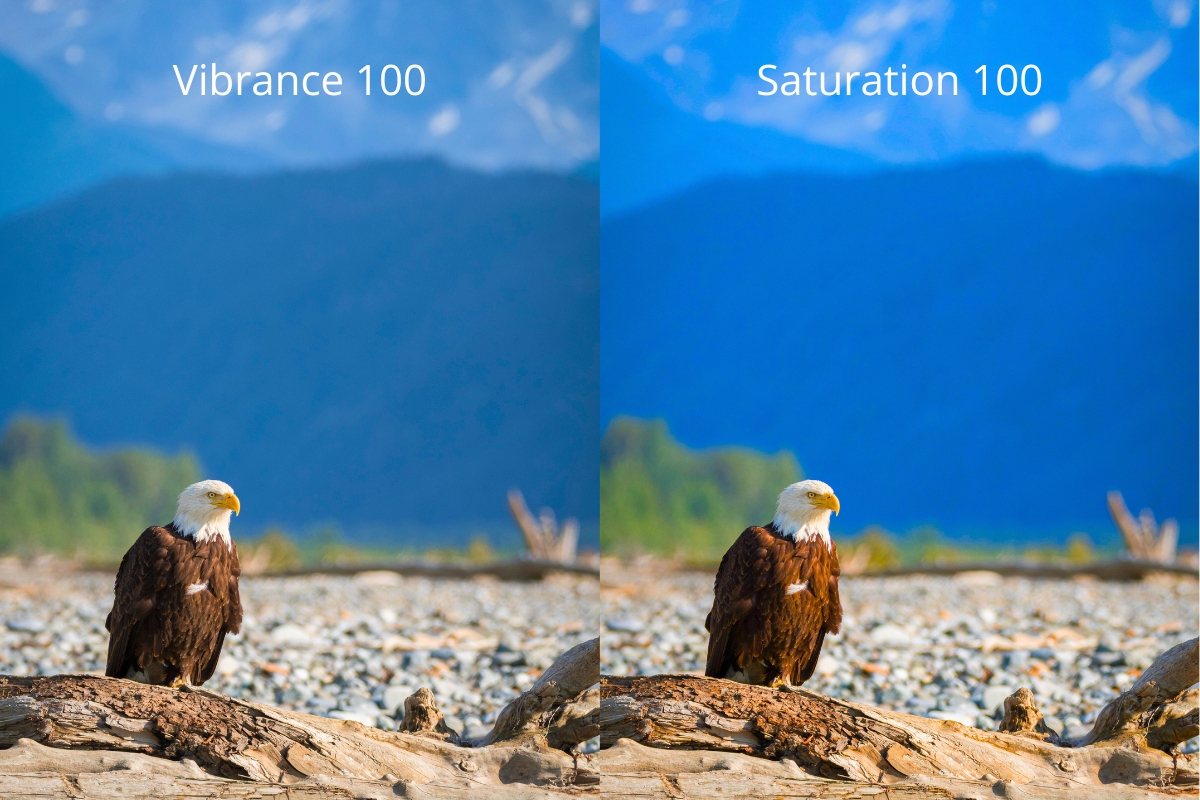
Take a look at this example below of a bald eagle in Alaska. The image on the left has the Vibrance slider all the way to 100 and no Saturation added. The image on the right has the Saturation slider all the way to 100 and no Vibrance added.
At first glance they look pretty similar. But it’s clear that turning the Saturation all the way up has really oversaturated ALL of the colors in the image on the right. The image on the left looks better because only the muted colors like the blue tones in the mountains and the red tones in the eagle’s wings have been enhanced. While that image may look better, it’s still a little too much color for my personal taste.
That’s why it’s usually best practice to make use of both Vibrance and Saturation at varying levels of intensity. Below is what the image looks like with Vibrance at 25 and Saturation at 7.
The Key Differences: Vibrance vs Saturation
Now that we’ve covered the basics, let’s dig deeper into how vibrance vs saturation differ in practice:
1. Color Intensity Adjustment
Saturation affects all colors equally, regardless of their current intensity. This can lead to oversaturation in already vivid areas. Vibrance, however, applies a smart algorithm that increases the intensity of less saturated colors more than the already saturated ones. This helps maintain a more balanced and natural look.
2. Impact on Skin Tones
One of the most significant differences I’ve noticed is how these tools handle skin tones. Saturation can quickly make people look sunburned or jaundiced if pushed too far. Vibrance, interestingly, is designed to protect skin tones. It’s much more forgiving when working with portraits or any images featuring people.
3. Preservation of Details
Oversaturating an image can lead to a loss of detail, especially in highlights and shadows. Vibrance tends to preserve these details better, as it’s more selective in its application. This can be crucial when working with complex scenes with a wide range of tones.
When to Use Saturation
Despite its potential pitfalls, saturation still has its place in the editing toolkit. Here are some scenarios where I find saturation particularly useful:
1. Creating Dramatic Landscapes
Sometimes, you want your landscape photos to have that extra punch. A slight boost in saturation can make sunset skies more vivid or autumn foliage more striking. Just be careful not to go overboard – subtlety is key. I often bump up the overall saturation slightly and then selectively saturate key areas, like darker moody clouds, to draw the viewer’s attention there.
2. Black and White Conversions
It might sound counterintuitive, but adjusting saturation before converting an image to black and white can dramatically affect the tonal range and contrast in the final monochrome image.
3. Correcting Faded or Underexposed Images
If you’re working with old, faded photos or slightly underexposed images, a gentle increase in saturation can help bring back some life to the colors. Again, the key here is to go light-handed with Saturation as a baseline start in your color correction process.
When to Use Vibrance
Vibrance is often my go-to tool for enhancing colors. Here’s when I find it particularly effective:
1. Portrait Photography
As mentioned earlier, vibrance is excellent for portraits. It can add a healthy glow to skin tones without making people look unnatural. I’ve saved countless portrait edits by opting for vibrance over saturation.
2. Mixed Lighting Scenarios
When dealing with scenes that have both vivid and muted colors, vibrance can help balance things out. It boosts the duller areas without oversaturating the already colorful parts.
3. Subtle Color Enhancements
For images that need just a little bit of a color boost, vibrance is usually the safer choice. It’s harder to go too far with vibrance, making it ideal for beginners or when you’re unsure about how much enhancement an image needs. I find this particularly true when working with photos of sweeping landscapes.
Vibrance and Saturation Workflow In Lightroom
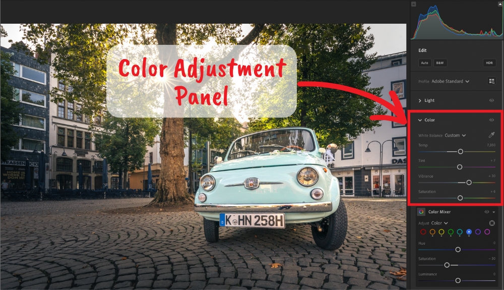
Here’s a simple Lightroom workflow for making color adjustments with vibrance and saturation.
- First, adjust your White Balance sliders to dial in the appropriate overall color temperature of your photo. This first step is crucial. Otherwise your other color adjustments will won’t look natural.
- Next, adjust your vibrance slider. This makes the colors pop. But it keeps the photo looking real.
- Drag the slider far to the right at first, until the colors begin to look unnatural. Then back it off just a bit until you’re happy with how it looks.
- Next, add a little saturation. This gives an extra kick. It also helps to fine-tune the colors. Again, you can intentionally overdo saturation at first, and then back off until it looks more natural.
- Toggle the Lightroom Before & After tool on and off by pressing [\] on your keyboard. This allows you to see how much your vibrance and saturation adjustments have impacted your image.
- Refine your color adjustments.
- Zoom out on your photo to make it smaller. Just like a painter, it helps to “step back” from your work from time to time to see the big picture.
- Make any final adjustments and then move on to other steps in your editing process.
Advanced Techniques: Combining Vibrance and Saturation
As you become more comfortable with your decisions about when to use vibrance vs saturation, you might find that using them in combination can yield fantastic results. Here are a couple of techniques I’ve developed over the years:
1. The Vibrance-Saturation Dance
Start by increasing vibrance to bring out the muted colors in your image. You can be more liberal in your application here. Then, if needed, add a touch of saturation to give the overall image a bit more pop. This approach allows you to enhance colors while maintaining a natural look.
2. Selective Saturation
Use vibrance to enhance the overall image, then use selective saturation adjustments (available in most advanced editing software) to target specific colors that need more intensity. This gives you precise control over your image’s color palette.
You can also experiment with the HSL Panel (Hue, Saturation, Luminance) to further refine very specific color ranges in your photo.
Here’s a video I made about using Lightroom’s gradient tool to make selective adjustments, including color.

Common Pitfalls to Avoid
While choosing to use vibrance vs saturation can become second nature over time, it’s still easy to misuse them. Here are some common mistakes to watch out for:
1. Oversaturation
This is probably the most common issue I see. Oversaturated images look unnatural and can be jarring to view. Always check your edits on multiple devices and, if possible, get a second opinion. I can’t tell you how many times I’ve asked my daughters whether something looks natural or not in my photos.
2. Ignoring the Histogram
Your editing software’s histogram can be a valuable tool when adjusting vibrance and saturation. Keep an eye on it to ensure you’re not clipping any color channels. NOTE: If you’re only seeing a black and white histogram, find out how to change your view inside the editing software to see a color version. This will help you better monitor your color distribution and intensity.
3. Forgetting About White Balance
Sometimes, what looks like a lack of vibrance or saturation is actually a white balance issue. Always adjust your white balance before diving into color enhancements.
Conclusion
Mastering the use of vibrance vs saturation during post processing is a crucial step in developing your photo editing skills. While they might seem similar at first glance, understanding their unique characteristics allows you to use them more effectively, resulting in images that are vibrant and natural-looking. Remember, the goal isn’t to create the most saturated image possible, but to enhance your photos in a way that brings out their best qualities while maintaining a sense of realism.As with all aspects of photography, practice and experimentation are key. Don’t be afraid to play around with these tools and develop your own style. The next time you’re editing a photo and reach for that color enhancement tool, pause for a moment. Ask yourself: “Is this a job for vibrance, saturation, or perhaps a combination of both?” With the knowledge you’ve gained from this guide, you’re now equipped to make that decision with confidence.


